January '24 - Belated Update!

I missed posting in January, as I let myself take a detour for Global Game Jam, followed by some downtime. Early in the month, I did get a couple of sprints in on the UI, both the in game menu system and the combat system. Most of this work was restructuring, but there was a bit of functionality added as well.
My primary goals were to improve the usability of the In Game Menu and to increase the information available to the player during combat, while reducing the amount of friction required to perform actions or use items.
For the in game menu system, I switched back from the modals into a full screen view, and for each screen I worked on the information architecture with the goal of getting the Most Useful info on the left side of the UI, with expanded depth as you read left to right.
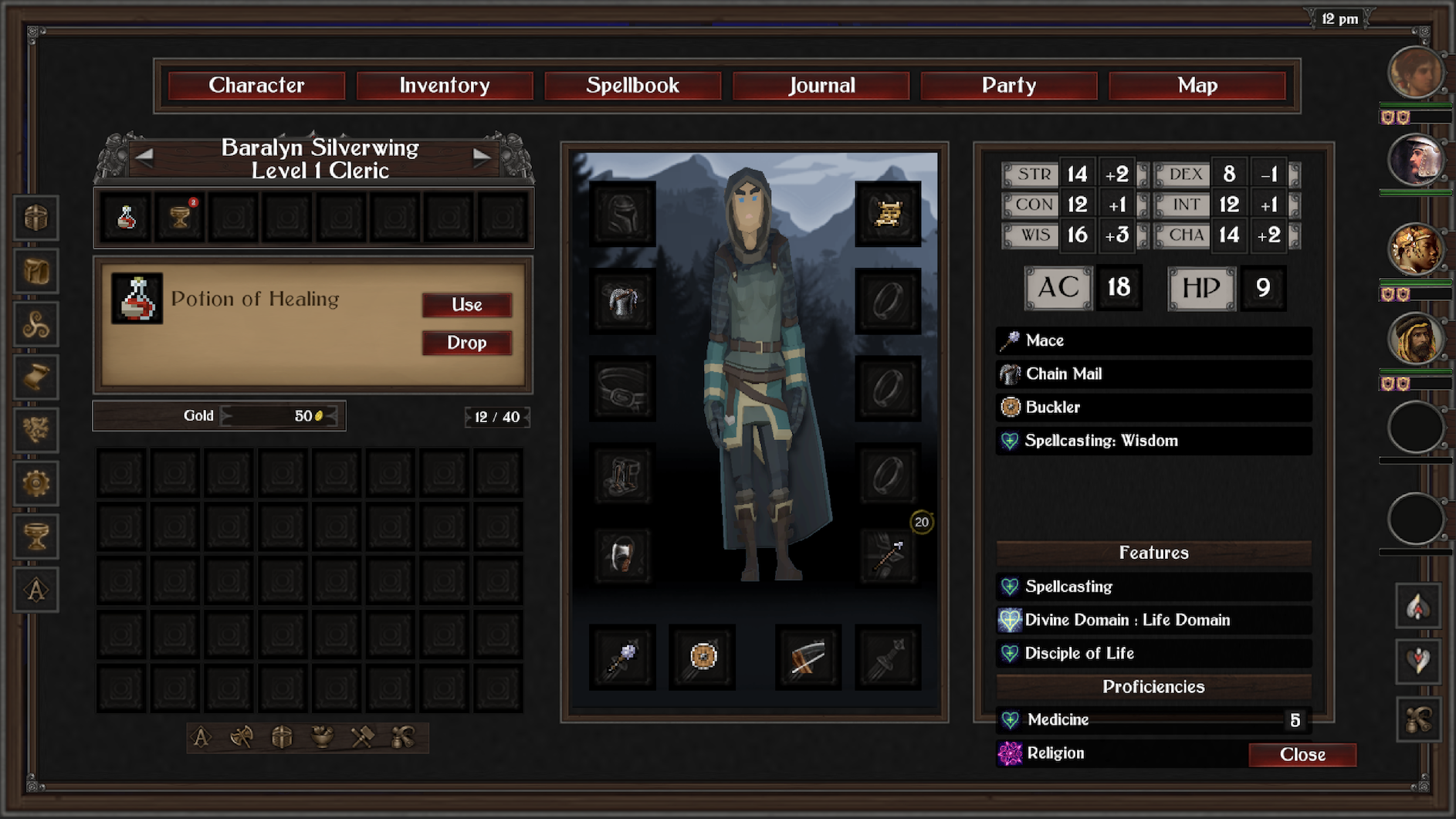
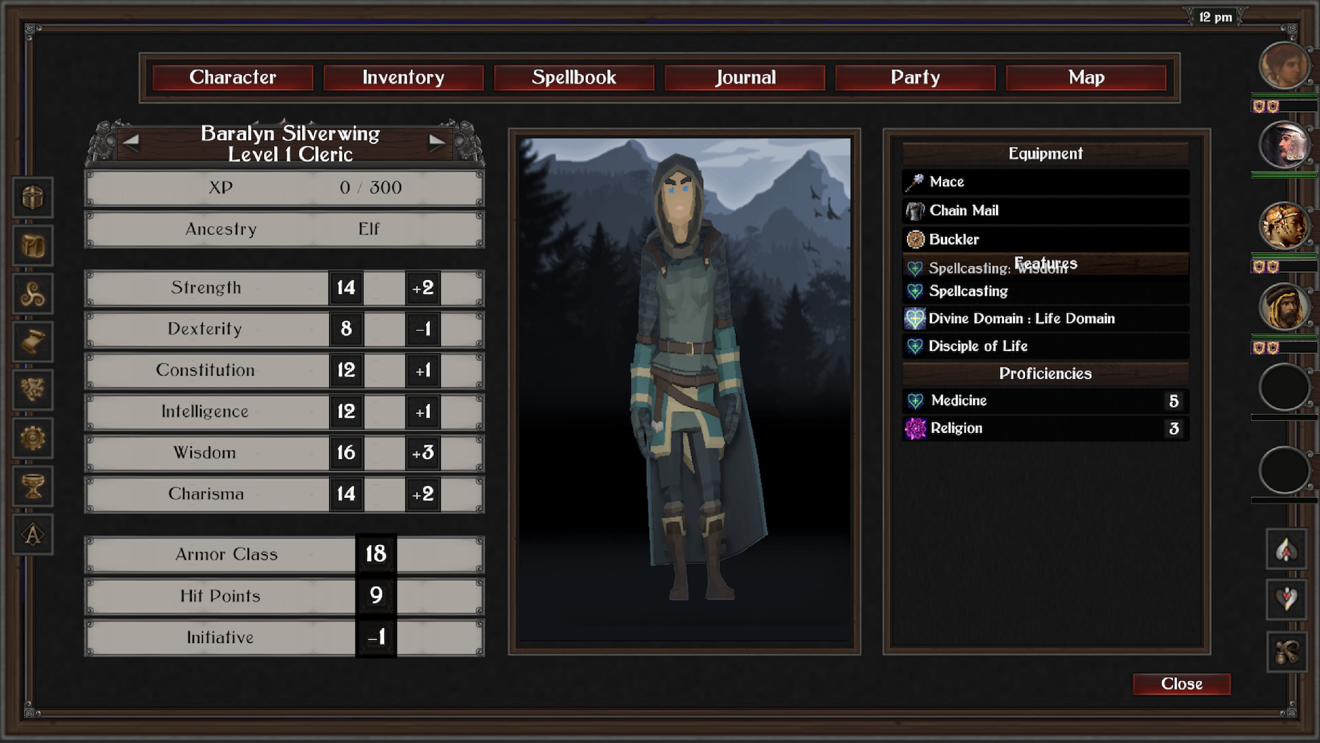
For the character screen, I gave priority to "How close is this character to leveling?" with insight on that left side to key stats and attributes. To the right, the Summary that I developed for the recent Character Creation overhaul gets more action, allowing the player to dig into character features and spells - useful when adding a new PC to the party.
Inventory contracts a bit, only a small bar for the player (I may add more), from which the new HUD will draw usable items into Action buttons automatically (removing the Quick Bar and Quick Slots entirely from the UX). Going fullscreen made it easier to make room for a small description panel, with an action per item type, and the ability to Drop the item to the floor. Summary bar on the right will compress to include stats, allowing the player to see how gear changes affect vital attributes.
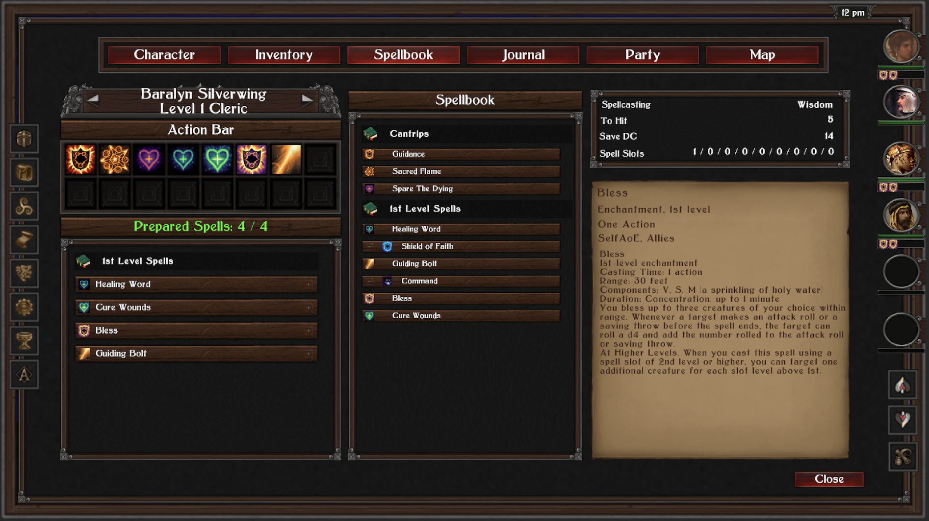
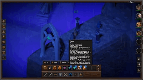
The new Spellbook view was the primary motivator. Prepared spells are now fully in place, and the player can view how the list of cantrips & prepared spells will appear in the action bar in the hud. I want to add drag and drop to that, allowing for full customization based on player preferences, but for now one can tweak it by removing/adding spells to the prepared list. Not shippable, but gets the idea across.
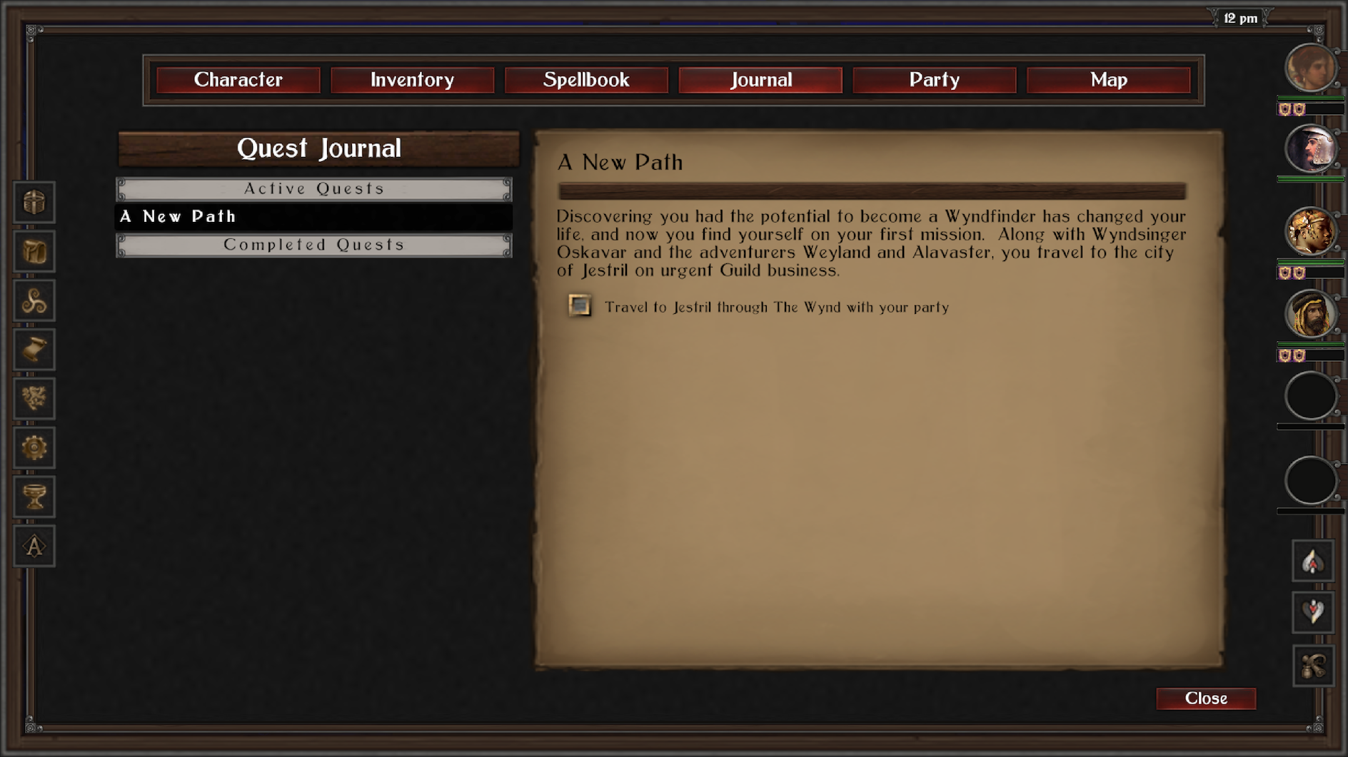
Lastly, a better Quest Journal experience (hopefully). Once the content goes from design to implementation, I know this will be really useful.
On to combat, where a significant set of changes make for a more streamlined experience.
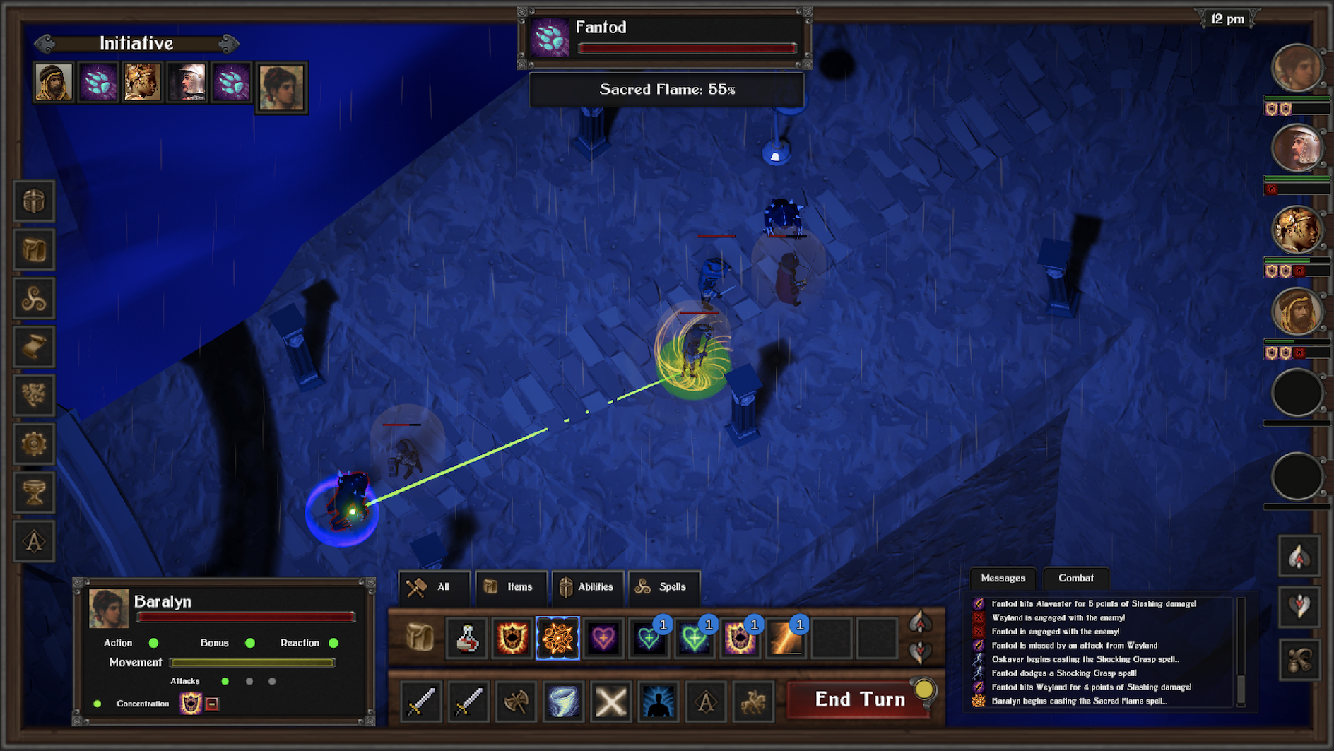
From the top down, the player can now see a % calculation of their odds of a successful move. I find this really useful early in the game, where one can glean some insight into an enemies Saves vs. their AC, as in above, where the sacred flame is probably less likely to do damage than just a melee attack, given the Fantod's DEX.
In the spirit of making the IA move left to right, the current Actor panel is now on the left side, giving the player insight into HP, actions, movement, attacks, concentration, and pet status. In the center, the streamlined Action bar now requires fewer interactions to do just about anything. The first tab gives the player every thing they can do, with up/down arrows to scroll as needed. Items, abilities, and spells are accessible by their own tabs, which'll come in handy once this thing fills up at later levels. Having a proper inventory and prepared spell load out becomes a part of gameplay in a much more over way. The message panel now sits on the right side, again, giving richer detail for the player if they want it.
The system feels a lot better to use - and while there is a lot to do here (lots of layout glitches in the menus still, for example), it's a significant improvement and I'm ready to get into content.
Leave a comment
Log in with itch.io to leave a comment.